ratsgame ch01: game ui
here is a study of game ui elements relative to how I would want ratsgame to feel.
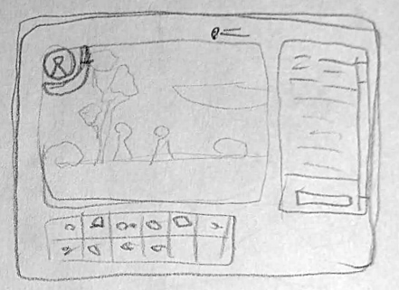
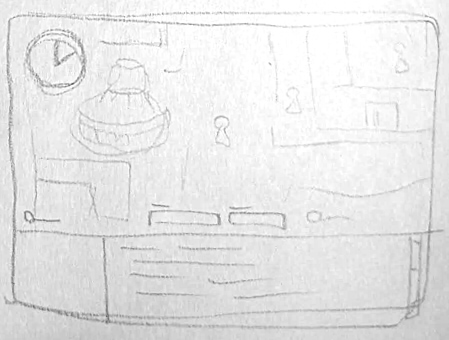
runescape - a very deliberate "you are playing a game" frameset, with stylized and textured UI elements to give it a more natural grungy feel
pros:
- clear distinction between what is game and what is not.
- fixed elements means less thinking involved - no need for window management
- health bar above character in combat
- everything you can do in the UI is visible and accessible within about two clicks, instead of hiding behind keybinds or having to remember which drop-down menu icon something is under
cons:
- small game world window means less immersion.
- inflexible for both player and developer (maybe a good thing?)
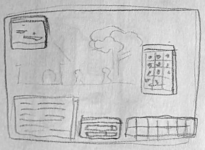
wow - standard for MMORPGs. skills at the bottom, windows to open/close on keybinds
pros:
- textures on UI elements are cool, like when they are old paper backgrounded
- a familiar layout for most game-players
cons:
- remembering keybinds sucks
- window management noise
- HP bar hard to keep track of
poe - standard for ARPGs. resource orbs instead of bars. cool potions thing on the left side
pros:
- the orbs are fantastical, very apparent what your health is, immersive (think about it, horizontal health bars are so ... statistical and corporate)
- equipment loadout UI is cool since you place items where they go on the body diagram
- no fiddling with window position and sizes, usually takes up the whole left or whole right side
- no UI elements on the top of the screen (dedicated to boss health area): less brain load
cons:
- a lot lot more dragging and dropping involved than other games (mechanically tiring, mouse precision requirement)
- have to look WAY UP for the boss HP, WAY BOTTOM-LEFT for your own HP, then WAY BOTTOM-RIGHT for your mana.
glitch - (rip glitch) the best game ever. one of the few games where all of inventory is visible, social-focused with left side dedicated to chat
pros:
- was a very modern websitey game with minimal textures and subtle-y gradient-ed web-like elements
- used to have a companion rock icon at the top you could always talk to. made you feel like you always had a friend
- had visual icons instead of bars - green smiley vs. red angry face to determine mood meter
cons:
- inventory became a mess once you had "bags" in your ... bag, and you had nested inventory grids
- too much space for chat (it was kind of a irc game though)
maplestory - honestly it's a huge mess and I don't know how they get away with it
pros:
- there are none
- ok maybe the random event UI elements you get to show you points or meters for the specific event is kinda cool but that gets annoying too because they get in the way of you trying to play the damn game
cons:
- arbitrary menu icons
- there are NINE drop-down menu icons on the screen with up to ELEVEN sub-menu items in each
- some elements are movable, some elements are immovable, no indication which one
- 5px * 5px buttons shouldn't be a thing
- have to remember keybinds for windows but there's no SPACE for UI elements when you have to bind 30 skills to your keyboard
- tiny hp bar at the bottom
- really hard to keep track of skill cooldowns with the immovable tiny icons on the very bottom left
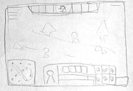
dota 2 - standard MOBA ui. minimap, teammates icons, skills in the middle, ~6 fixed slots for items
pros:
- not many elements to manage - only toggle in-game element is the store and scoreboard
- HP bar above character good.
- I like teammate icons being at the top of the screen
cons:
- debuff icons are very small
- player current EXP is almost impossible to see
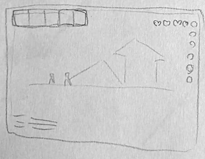
terraria - simple UI with items bar on top left and resources on top right
pros:
- maximum space given to game world
- it's either you have everything showing, or nothing showing (inventory/equipment open or closed)
cons:
- health absolutely impossible to keep track of, tiny heart icons on the top right just isn't the way
- mana goes downwards and health goes sideways-and-also-downwards when at max health icon count and then also changes color at MAXHP???
elona+ - old style single player RPG UI
pros:
- heavily text-based, minimal imagery noise in UI
- distinct bottom part of screen dedicated to UI
- easy to scroll up the text log to see history of game events
- minimap on bottom left useful for navigating towns etc.
- the text logs are fun when they write out quirky things
cons:
- many, many UI windows, difficult keybinds and navigation of them
REVIEW TIME
i don't have much of an idea of what ratsgame is going to look like, so this was fun to do
considerations made on what I want to bring into ratsgame
- poe: I want the potion slot frames showing at all times
- runescape/dota: I want the HP bar to be visible above the character (if this is even going to be a combat game)
- dota: the player icons at the top, I think it would be cool if they could be skill icons. would be clear on what cooldowns are
- runescape/glitch: I like a fixed area where it shows inventory at all times
- glitch: a companion, icon visible at all times, to help you with the game
other:
- i think no minimap, but world map
- i like the idea of an events log where you can scroll up to see everything that happened