Past Layouts
Past layouts used by this personal site.
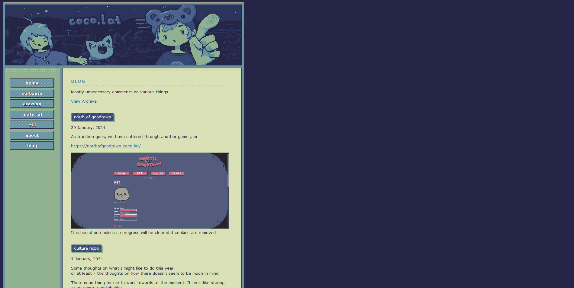
The amount of content this website has had does not justify the number of layouts it has gone through - but we do not talk about that.
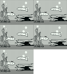
faker's dozen
I could not be contained in one site
I broke up into shards
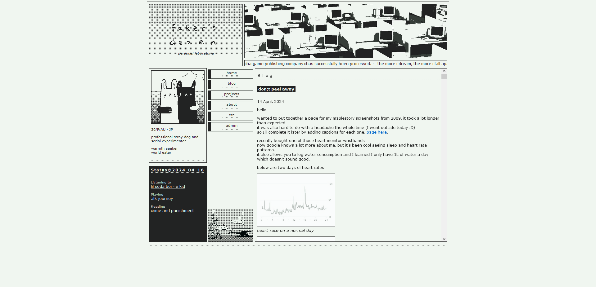
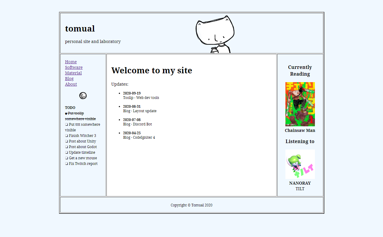
Table Town
It's a HTML table
Wanted to go for a more simple oldweb look and return to having more menu items
But this one might have been too simple
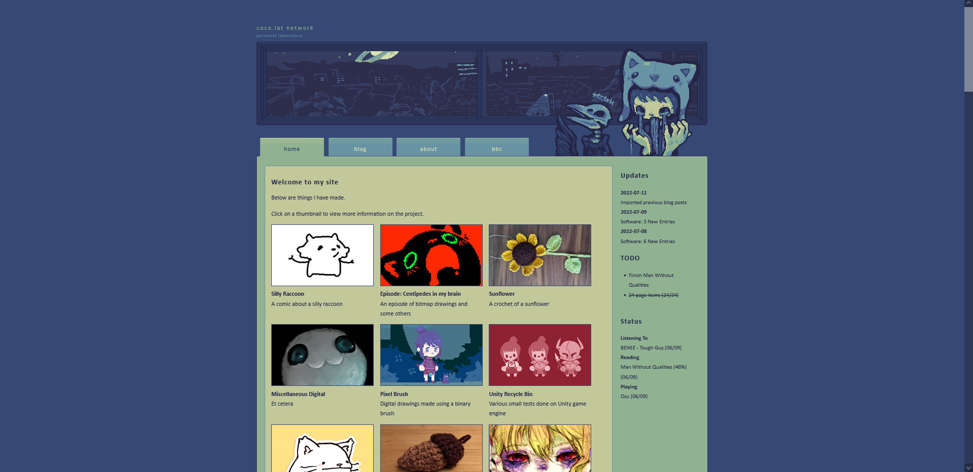
Froghat Boy
Features the usual Bearhat Boy, except he's Froghat now.
Goes for a moderately stylized cartoon feel.
There is a window that you can drag open.
Not sure how I feel about the colors, it is much preferred over the grayscale themes however.
Overhauled site structure, going from a standard hierarchical page format to basically one-layer navigation.
'Software', 'Art', 'About' removed from menu.
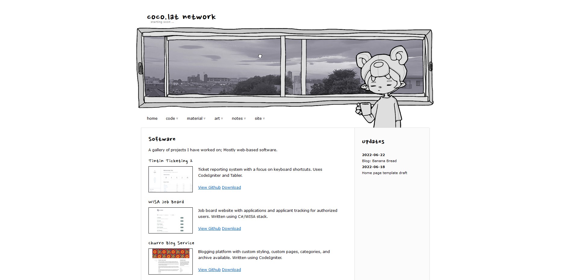
Bearhat Window
A short-lived monochromatic predecessor to the Froghat layout.
Spawned the idea of the draggable window.
Definitely wasn't feeling this one, as you can tell with the expression I had given the boy.
The view outside is a photograph - a photograph of what it looks like outside my window.
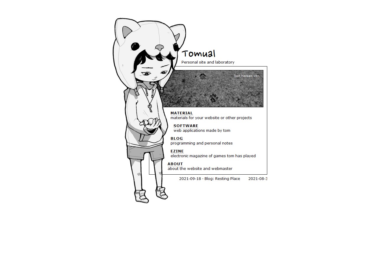
Bearhat Boy
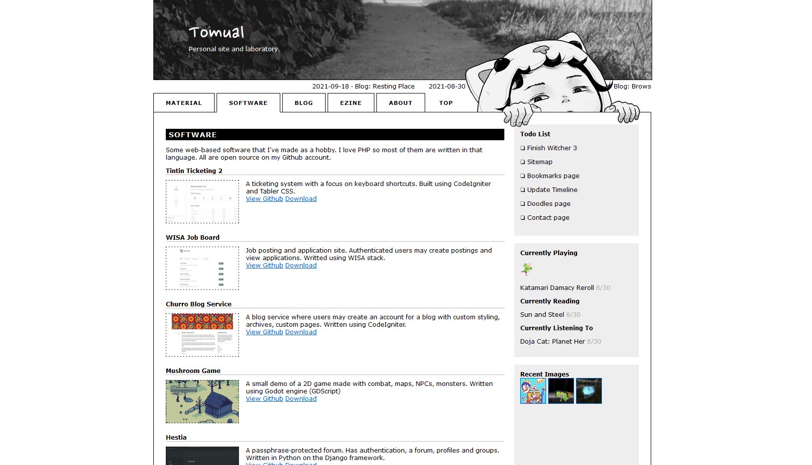
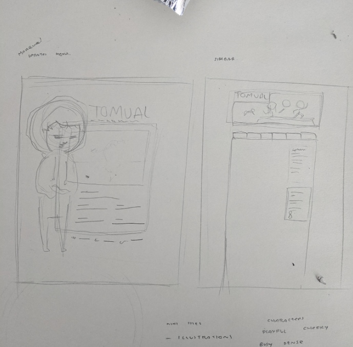
Origins of Bearhat Boy.
This layout was likely the most balanced between personality and usability.
The mix of photography and illustration gave it depth and humanity.
Marquees were in use to bring back the old web feeling.
Started "Recently Listening/Reading/Playing" in the sidebar.
Home page and main page have different layouts.
Milk Man
This layout was out of a desire to have a HTML table layout like back in the days.
This is where I started listing out what I'm currently listening to, and what game I am playing, or what I am reading, which I really began to enjoy because it was this piece of personal current thing that you could share with other people.
Ward All The Things
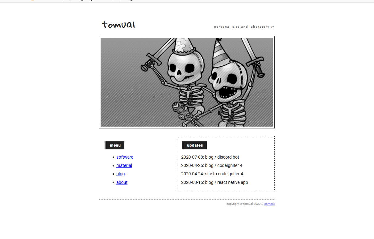
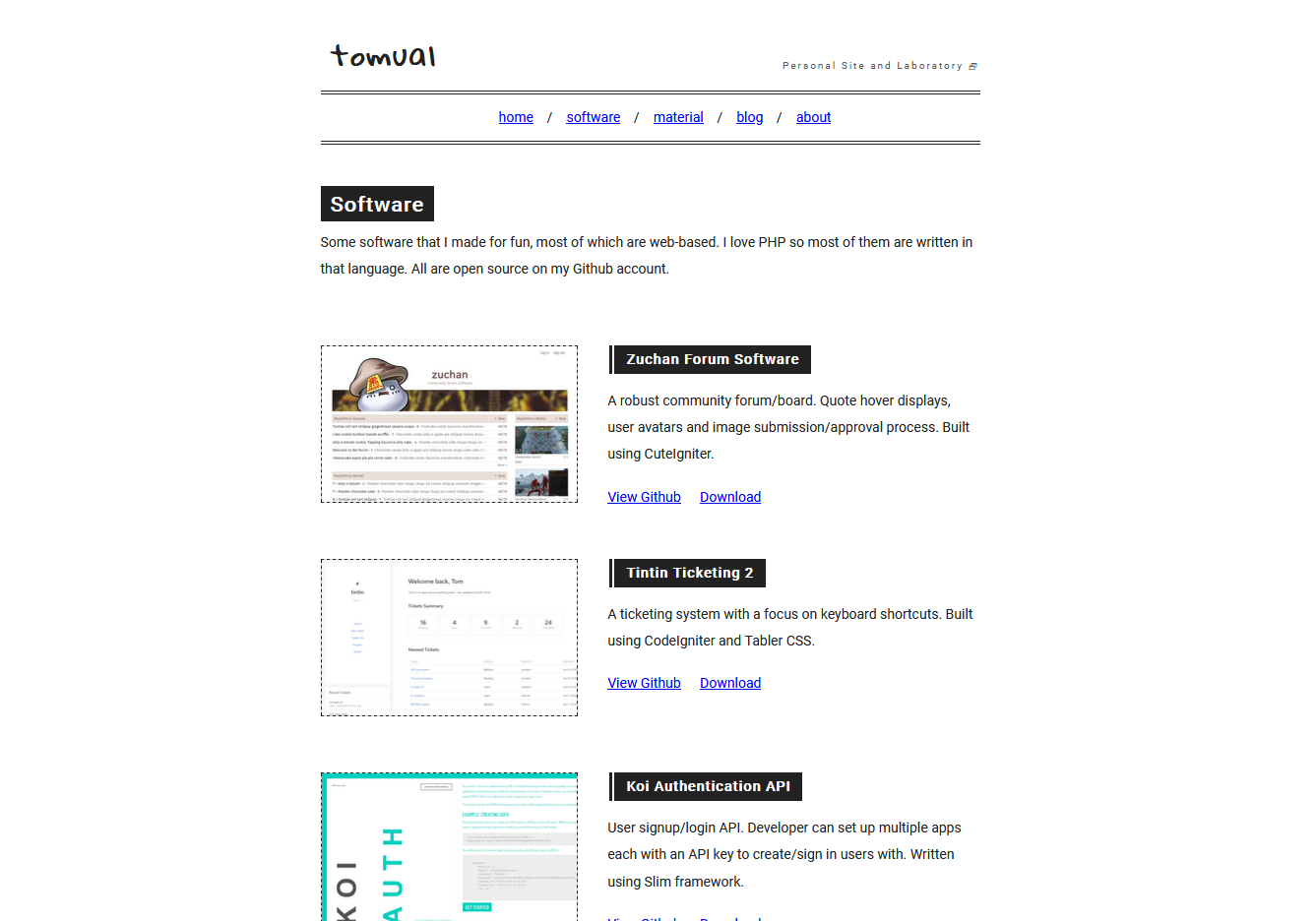
First successful grayscale layout.
Banner image was some stream fan art I did for PurgeGamers.
He used that image as his Steam profile about 6 months.
This is irrelevant information.
Still was struggling to try and adhere to modern web standards (especially to cater for mobiles).
Regular page layout was simple, but bland.
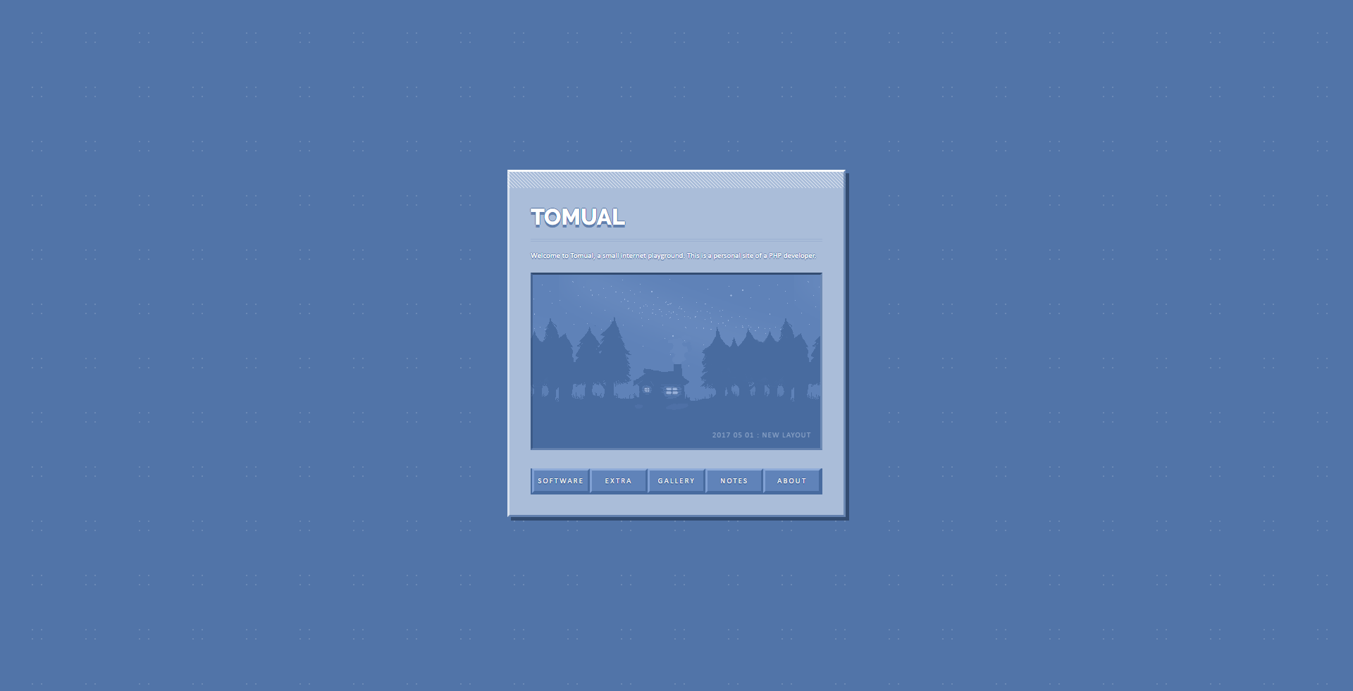
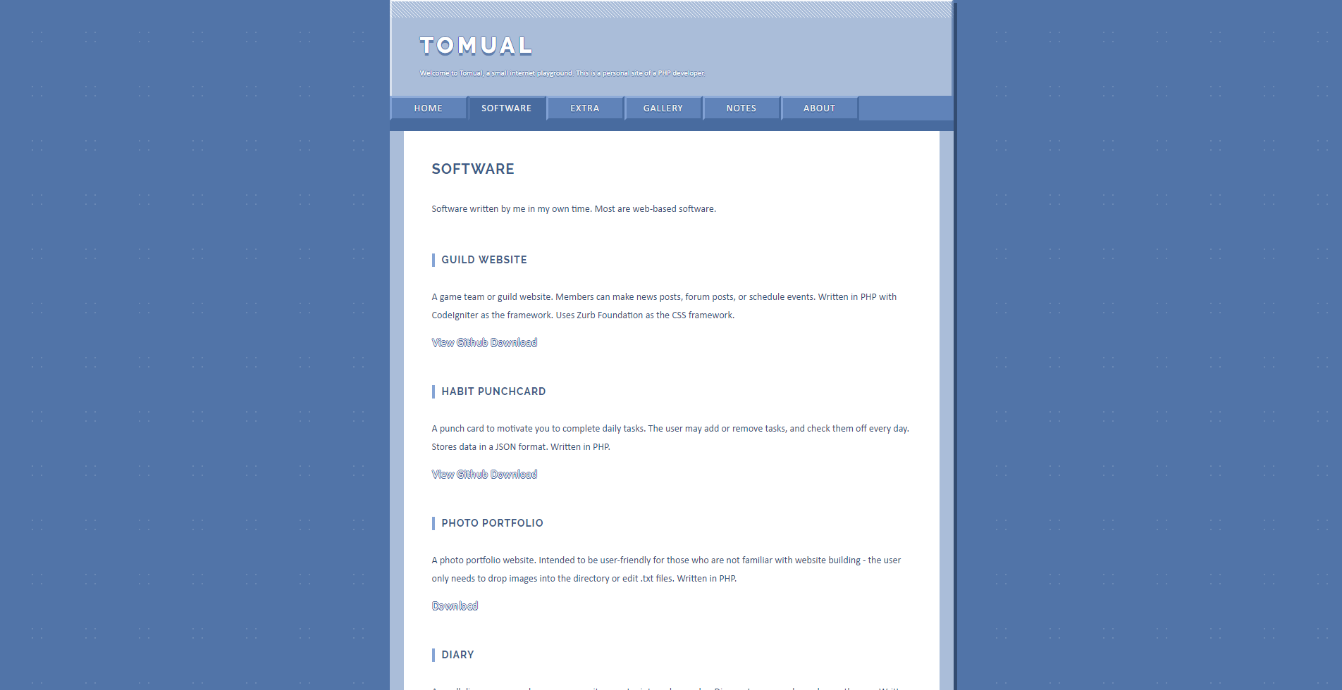
Plastic Buttons
An attempt to do a variation on my first layout.
Wanted the buttons to feel like those on a casette player.
The page layout, while colored, is still bland.
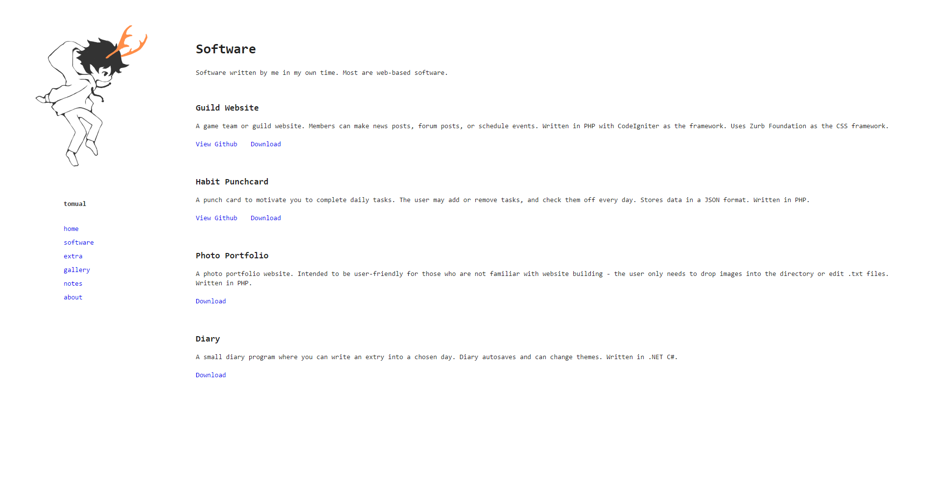
Deerboy
Absolute garbage attempt at a minimal site.
Illustration on the side with orange as the accent color.
Inspired by old Japanese personal sites which have a full-height sidebar with navigation menus.
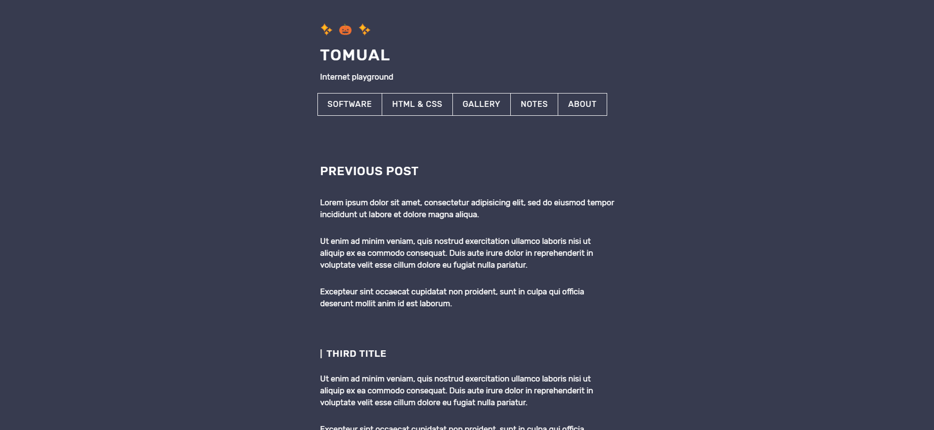
Dev Site
A "Developer" website layout.
First time considering mobile users (they are not human).
Looking back at this, I think it's a great layout for its purpose,
which was to display developer blog posts.
Coin
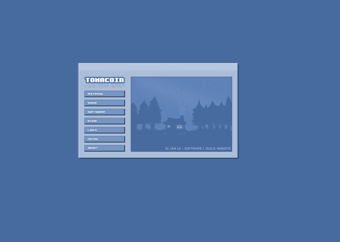
My first layout.
This one has remained to be the top layout.
Used my favorite colors, a comfortable home page feature image, and smallcute elements.
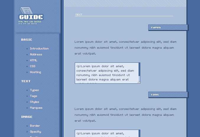
Had a fairly large HTML/CSS tutorial. Don't know where that went. I should find it.
Was quite hard to read, with the bitmap custom font.
Others
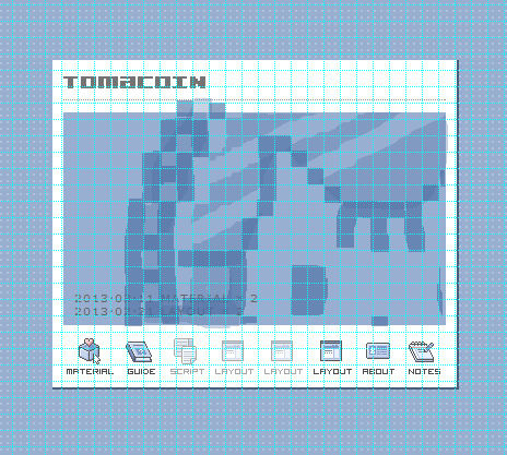
Below is one of the drafts for a first layout.
Used images as the navigation links, which is a very oldweb feature.
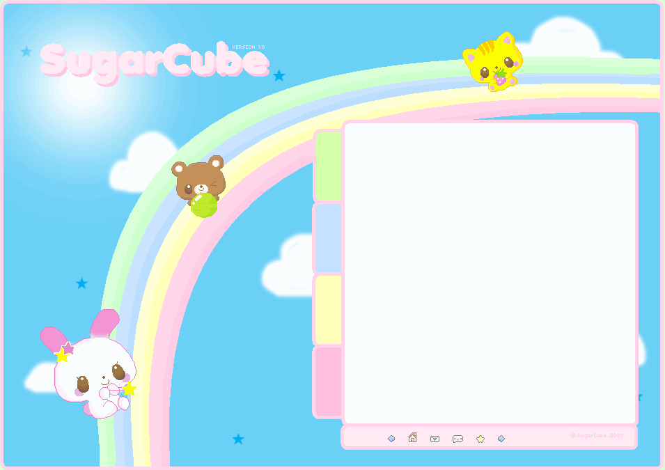
Below is a layout made in 2007, using MS Paint.
Was from an era where many girls made adorable personal websites with handcrafted layouts.
You couldn't enter the community unless you were under paid hosting though, which was not an option for me at the time.
